Thursday, 2 May 2019

Conclusion

A number of elements have slipped since conception and planning. Characters and environment details were pared down. Problems were found in the technical elements of rigging and this placed stress on the animation process. Sound also remains incomplete.

With all this said, style, shot sizing and angles, timing and transitions were utilised in an attempt to produce the desired effect.

Some useful outcomes of this process may be to reinforce the importance of planning within a realistic scope and learning how to balance technical considerations against the need to tell the story. Most useful however, will be the development of story and discovering new ways to take this to the audience.

On to the next one…

Some Notes on Final Shots


These are some notes on the types of shots used throughout the film. It should also be noted that the camera is restricted to a 180’ arc to maintain spatial continuity.


High angle shots work to make the subject look smaller or weaker within the scene. In this shot, lights were also adjusted to produce a long shadow spilling into the scene. Materials were also substituted as the baked light map could not receive shadows.

Frame within a frame. This style of framing can tighten the shot using scene elements, focussing attention and creating a more claustrophobic feel.

Framing with perspective. Perspective lines lead to the focal point of the shot which, in this case is also picked out in high contrast.

Framing with light. In this shot, a spotlight with a soft penumbra frames the subject and closes the surrounding space.

A short focal length exaggerates depth and distorts in the periphery to create a disconcerting effect.


Reverse angle shots were used as a device for introducing a character and revealing their point of view or as a means of portraying action and reaction.

Saturday, 30 March 2019

Bake Off/Trade Off - Light Maps

Trying to reduce render times.

The static elements in the scene (lighting and geometry) allow for "baking" lighting effects into textures. The UV layouts are expensive in time but worth it. Not only do they reduce render times hugely, but the resulting images can be quite intriguing in their own right.


Shooting Craps

As the models, textures and lighting come together, we're starting to get a real idea of the final look.

From the opening pedestal camera move in the lift car....


... to the drama of the Doctor's office interior...


Render times remain a problem and we'll look at that next.

The New Shot List Was Missing.....

I'd been following this revised shot list but hadn't posted it. This was created using proxy models for environment and character. A loose shot tempo is represented by the heart beat graphic.

Click on an image to view more detail.


This set of shots for the doctor's office remain unresolved. Options are still being considered while working on technical elements.


A Real Rig-marole

Choosing an "auto-rigging" solution over a manual build was meant to save me some time, grief and mental fatigue.

Advanced Skeleton (www.animationstudios.com.au/advanced-skeleton) is a fantastic tool but the basic process requires a model to have specific attributes and the steps to be followed. Mistakes while learning were plentiful.


Perseverance was key. The facial rigging scripts, once parameters were defined, were amazing to watch in action.

The Model Protagonist in Summary

Here's our man.

Ready to go.


Rigging up next followed by a serious look at scene optimisation. Render times are killing me

Friday, 8 March 2019

Hair-dos, Hair-Don'ts

There were some positive aspects to Maya's MASH networking in placing David's hair-cards.

  • It was fast
  • There was the ability to add randomness in scale, tangent angle and placement
  • Many cards could be placed automatically, covering the entire surface of the scalp

Hair-cards applied using MASH

The results initially looked promising but did reveal a number of problems.

  • It was unpredictable
  • Many cards became clumped at peculiar angles
  • The process removed the individual pivot point of each card making adjustments from the root and manipulation difficult.
  • While visually effective from frontal angles, other angles proved much less satisfactory.
  • This would require a lot of time consuming manual adjustment made more difficult by the heavily overlaid geometry and pivot placement
I made the decision to go "fully manual" and restarted the process. The new set of cards were created, pivot points adjusted and the geometry manually placed. 


Manually created hair-cards, textured (colour and transmission maps) 

Initial placement of border cards

Further work in placement

Wednesday, 6 March 2019

The Clothes Horse

New haircut, new boots, new pants. David has also finally got some clothes


The shorts need some more work, all need texturing but I feel that he's finally coming together as a character.

Hair Tomorrow

This is David's new haircut. I experimented with a few tools for applying the hair-card geometry to the head and settled on Maya's MASH network.


The Arnold shader caused a lot of problems in set up and I'm still not entirely sure why. there is a simple combination of colour, specular and transmission maps but they initially refused to work.

The hair requires more styling but the silhouette is starting to work.

Hare Today

I've decided to try hair-cards for David's character. This approach looks reasonably effective, efficient and controllable with, hopefully, low overheads at render time.

Tests required

Tuesday, 26 February 2019

A Look Outside The Window

Looking outwards at artists and works I was less familiar with, these animations provided a variety of shots, framing, transitions, colour and metaphor to consider while looking at my own work.

Estonian cartoonist and animator Priit Pärn, presents several shorts within a short in his 1987 film Eine Murul (Breakfast on the Grass).


First Slide

The top row looks at framing, camera angle and composition.
  • A long shot presents the character in a tight corridor. With space behind, the way forward is blocked
  • A tight close up presents a grim-faced profile shot. Eye level, close and personal, claustrophobic even in an external street scene.
  • The perspective of the supermarket shelves leads the eye to the approaching character. The character is animated in faded transitions as the environment remains static. Perhaps a suggestion of passing time.
The bottom row starts with a heavy metaphor.
  • Birds fly in an expansive, clear sky while below our tiny protagonist is captive, held to the ground.
  • From cartoon scenes of cool, muted blues and greens the film turns in style and colour. Leaning towards photo-real, warm, tawny and umber hues take over. An open window frames the outside world, a large expanse in comparison to the character's scale, his head coincident with the horizon.
  • The lift car. A filmic device. While this one appears as a means of escape from the prowling figure, mine is designed as an inevitable descent, a sarcophagal journey to another world.


Second Slide

This affecting sequence examines a woman's loss of identity in motherhood. Her efforts to find her former self are frustrated at every attempt. Again, heavy in metaphor, her lost personality can be seen in the blank mask. She attempts to redefine herself, repainting her image as a poor simulation of her former self. Even these efforts are physically wiped away by her child.

The use of makeup (another mask?) as a means of deliverance appears to point towards a conflict between the external image and internal feelings. The fight for the external is ultimately fruitless and as we see mother and daughter grow, the natural face of the mother reappears.


Third Slide

The final shots follow mother and daughter through a fair. The mother carries an apple (the forbidden fruit, signifying knowledge?) which she exchanges for helium balloons. There is a suggestion that she may take an opportunity for freedom before handing the balloons to her child, her natural image is restored and the next generation is allowed to fly away.

Quite beautifully realised.

Next up...

Directed and written by Israeli born Ari Folman, the 2008 Oscar winning Vals Im Bashir (Waltz With Bashir) deals with a veteran of the war in Lebanon and his efforts to reconstruct his own memory of the period.

I'll continue with that one later.

Saturday, 16 February 2019

Other Ways of Looking

This was another vision of a tracking shot from the Leica reel. Hand drawn and representing three key frames as the protagonist passes a door. He's head-down and shuffling before his name is whispered from a dark cell.


I'm tempted to put the image's layers through Premiere.

The Curse of the CU - Technical update

The retop is complete on the shoe model and, beyond the normal map projection, only simple PBR materials have been applied so far.

David's shoe retopology - Complete

David's shoe - Arnold render

David's shoe - Arnold render


This model is a single, manifold mesh and I'm now wondering if that was the best approach. A little more work and time will tell.

Friday, 15 February 2019

The Curse of the CU

The film starts with a "set up" rather than a traditional, wide establishing shot. The upward pedestal of the camera scans over the protagonist while accentuating his descent in the lift car.

It looks to be a promising and affecting shot.

A possible downside is that every detail of the character is revealed in closeup, requiring detailed modelling and texturing of every element.

Take these shoes as an example...

David's shoe - Sculpt

David's shoe - Sculpt

David's shoe - Retopology

The textures will reveal that they are old and battered, the lack of laces a clue to the situation of their owner. All well and good but... they will be seen closeup so require that much more work.

Leica It or Not

I've taken a character proxy, rough 'n' ugly rigged it and thrown it at the environment to work out some shot timing, camera angles and transitions.


It ain't right but that's not a bad thing. Figuring out what's wrong is half the battle?

Re-framing in Premiere can help a little but some shots are revealed as being ineffectual. The high angle, long shot and track to the lift doors is a car crash at the moment. Other shots show promise but could need cut-away to emphasise impact.

There are some alternate shots and moves in this lot but more experimentation is required.

Saturday, 9 February 2019

Time for T (pose)


Taking this character to a full body t-pose raises a few issues.

It's not a particularly natural pose. In relation to a relaxed pose, the clavicles and scapula are raised, trapezius and deltoid muscles are pronounced, the latissimus dorsi are flared and the pectorals are elongated. How will all this translate when rigged?

The proportions need tweaking here. The navel is low and the leg bones need attention


Some adjustments have been made. A mouth sack has also been added. The closed, puckered mouth would have made the task of retopologising the head for animation very tricky. The more relaxed jaw should allow for effective use of edge loops around the mouth.

Wednesday, 16 January 2019

Light Fakery

One method I have explored for reducing the number of lights in a scene is the use of emissive materials.
Lift car interior
The lift car is contained within semi-opaque walls. Lighting from behind using, for example, four area lights and transmissive materials could lead to hugely increased render times.

This solution uses one point light and the walls have a subtle glow. While it may not be physically accurate, it does give a pleasing result.

Illusions - Angel Columns & The Missing Figures

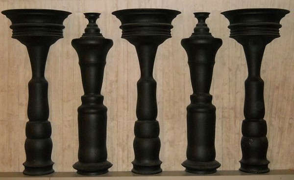
I'd considered including optical illusion imagery within the scene to signify or emphasise the psychological leanings of the story. My first thought was to use simple framed images (and that is still a plan) but I came across this 3D illusion in my searches.

Angel Columns at the Phaeno Science Center
Angel Columns, David Barker (1989)
www.anopticalillusion.com/2013/09/angel-columns-at-the-phaeno-science-center/
Using negative space, Barker's piece presents a series of symmetrical, standing figures.

This led me to search for images that would suit my purpose, push the idea of authority and control. I took images of chained prisoners and developed them in a similar way, turning columns and placing them to fool the eye with negative space. These would form balusters as part of a screen in the Doctor's office.
Development of image to column
Having a set of four columns which would create two symmetrical characters, it was a small leap to juxtapose them in different combinations to produce four asymmetrical figures.

Angel columns recreation - Arnold render